Beautifully executed graphic design can take your business or event from zero to hero in a few clicks of a mouse.
With the wealth of design talent available and the ever-increasing capabilities of design software, there really is no excuse for boring, uninspiring design.
Just look at these 10 stand out examples of beautiful design, covering a range of business and event collateral, and fire up your imagination!
1. Website design
Cafe.monocle.com is gorgeous example of a flat, one page website. It’s a beautifully simple, highly attractive design, light on text and heavy on hero images. This style won’t work for information-heavy companies/events, but it’s surprising how much can be conveyed with pictures alone. Before you upload your own version of War and Peace to the web think if all that text is really necessary.
There’s an old saying that we eat with our eyes, but whether you’re serving food or not, you want to whet the appetite of your customer!
2. Video design
http://vimeo.com/93391437
Berks Werks designed an animated video for live events agency Concerto Live to highlight the company’s character and capabilities. To do this, they created Clive, a cute little blue fella who walks the audience through some of the agency’s achievements to date.
Clive is “what Concerto Live would look like if it grew legs and came of life,” they say. It’s a great example of turning your company ethos into something tangible in a fun and engaging way.
3. Logo design
This beautiful logo, which looks like an explosion of life, was designed for The RE-VIVE festival, which took place in Durham last year. The festival, hosted by Durham Recovery and Wellbeing centre, was a celebration of recovery from drug and alcohol abuse. Aims of the event were promoting community re-integration, dispelling myths around addiction and bringing the local community together.
According to design agency Logofoo, the logo took the theme of a heartbeat/helping hand, and the client loved it: “It completely fits the vision of the recovery festival”.
4. Web banner ad design
With so much ‘noise’ on the web, banner ads must really stand out to attract clicks. Here’s a fun example of an interactive banner ad from GlaxoSmithKline. Designed by Memac Ogilvy, it brilliantly illustrates the feeling one gets with a bad headache, and the effectiveness of using Panadol Actifast. See what happens when you pop the pill here.
5. Flyer design
The brief for this project was simple, create a flyer that goes along with the folding theme of the California State University Graphic Design BFA Show, titled 20 FOLD. So, that’s exactly what designer Darren Nguyen did. No matter which orientation the recipient chooses, the sophisticated design places all the necessary information above the fold.
6. Business card design
Business cards are often the first point of contact a potential customer will have with your company – be sure to make an impression! These lavish cards, designed by Device, certainly say all the right things about nightlife and hospitality group The V Group. Laser engraved, with a red inner core and red metallic foil edging, these are cards worth keeping.
7. Brochure design
Beautiful design isn’t a new phenomenon. Look at this charming vintage Citroen pamphlet from the 1960s. Francois-Charles of iconomaque discovered it recently while sorting through his father’s studio. Why not channel the vintage vibe for timeless style in your design projects?
8. App design

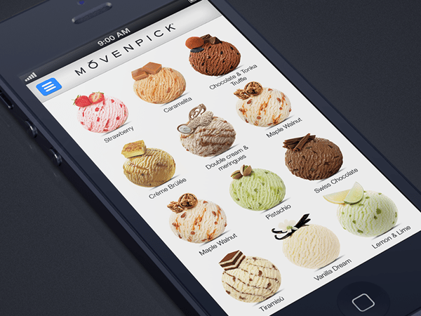
Great app design means paring down the information and features from your full website to offer a beautiful user experience on the small screen. Here’s a perfect example. The Movenpick ice cream app lets users discover the nearest retailers to them and check out the latest flavours on offer. The simple design by Alex Bender works brilliantly, letting users take their pick of the licks.
9. Billboard design

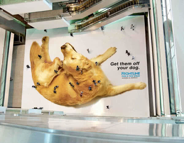
Walking over this floor sticker you’d be hard pressed not to notice the giant image of a dog, but it’s not until you ascend the escalators to the floors above that the message of the ad really becomes clear. The people have become the fleas! Clever, eh? The brief for Saatchi & Saatchi Jakarta was to create an impactful ad on a budget. The brilliantly creative solution aims to send the message that while you might be close to your pet, you might be totally blind to flea infestations.
10. Event invitation design

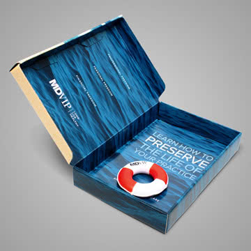
Is your audience hard to reach? Then your event invitations need to stand out. This striking invite targeted at busy GPs was designed by MDG Advertising to promote an event organised by MDVIP, a US network of physicians.
The invite took the form of a box, designed to look like a beach, with a warning sign that read “A wave of healthcare reforms is coming”. Inside, recipients found a miniature life preserver with the message: “Learn how to preserve the life of your practice”. Quirky and clever, the campaign won the 2013 Gold ADDY® Award.
Conclusion
Creative design can make your business or event stand out from the crowd. Give each piece of collateral the love and attention it deserves and you’ll be making designs on success.
If you found this useful, join thousands of other organisers and sign up to our newsletter for more timely updates, insights and advice every Monday morning.


